
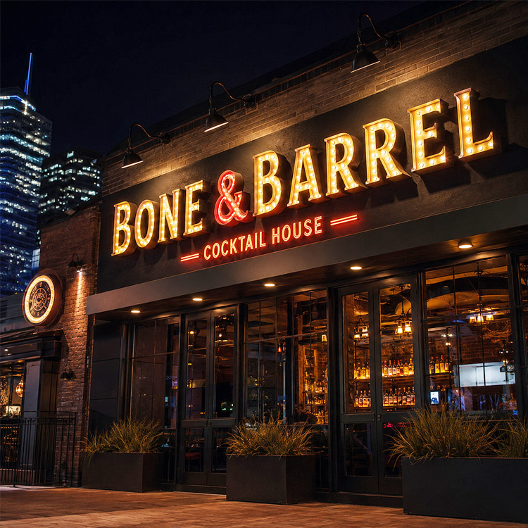
Storefront channel letters are now expected to do more than light up. They have to fit the local sign code, suit the building they are mounted on and still give the brand a strong look by day and by night. A recent trade magazine feature (see the source note at the end) looked at three recent channel letter projects in the United States. Below is a short summary, followed by our own notes for buyers.
What the recent projects show
- Working within a strict sign code: a restaurant had only a small allowance for hanging or awning signs, so the team used a wall sign instead. Under the city’s definition of a wall sign, the letters could hang from steel bracket arms touching the storefront mullions. The finished sign is about 15 feet wide and uses faux neon open-face channel letters. During approval the city tightened its lighting rules and required the sign to dim to a low level, and the design was adjusted before it was approved.
- Day/night letter faces: on light-coloured buildings, two projects used day/night film or perforated vinyl so that the letters read dark during the day and glow white at night. The shop noted a short period around dusk when the effect can look muted.
- Edge-lit letters and wireways: where there was no access behind the fascia, a project used wireways to carry the wiring, and chose edge-lit letters for a cleaner look. The feature notes that wireways can be concealed if they are planned early.
In the restaurant project, the designer described faux neon open-face letters as a way to get the look of open-face neon without the cost, fragility and maintenance of glass neon. The feature presents this as the designer’s view and does not give a cost comparison.
Our notes for storefront sign buyers
The points below are Sunpin Sign’s own commentary and are not part of the original feature.
Check the sign code before the design is fixed
Sign rules differ from city to city and between shopping centres. Before the artwork is final, it helps to confirm the allowed sign area, how each sign type is defined (wall, projecting or hanging) and any limits on brightness or night-time dimming. If dimming is required, the lighting can be specified with dimmable power supplies from the start. Final approval always rests with the local authority or landlord.
Choose the letter style for the look you want
- Open-face LED letters with an exposed light line can give a neon-style look. See our LED channel letters and LED neon signs.
- Front-lit letters with acrylic faces suit most storefronts and read clearly from a distance.
- Halo-lit or edge-lit letters give a softer, more architectural look. See our illuminated signs.
- Day/night faces can help when a brand colour is dark but the sign also needs to glow at night.
Plan mounting and wiring early
Decide how the letters will be fixed (flush, on stand-offs, on a raceway or wireway, or on brackets) and whether there is access behind the fascia. Sending the facade drawings and photos of the mounting surface early makes it easier to plan concealed cable routes and the position of power supplies.
Specify for outdoor use and easy service
For exterior signs, ask for LED modules and power supplies rated for outdoor use, and agree how the sign can be accessed later if a part needs to be replaced.
Planning storefront channel letters?
Send us your logo files, facade drawings and any sign code or landlord requirements, and we can discuss suitable letter types, sizes and mounting options. Contact Sunpin Sign to discuss your project.
Source: Signs of the Times. Original article: https://signsofthetimes.com/3-contemporary-channel-letter-sign-solutions/. This article is written by Sunpin Sign in its own words and is provided for general information only. Sunpin Sign is not affiliated with Signs of the Times or with any business mentioned in the original article.